Line and Shape


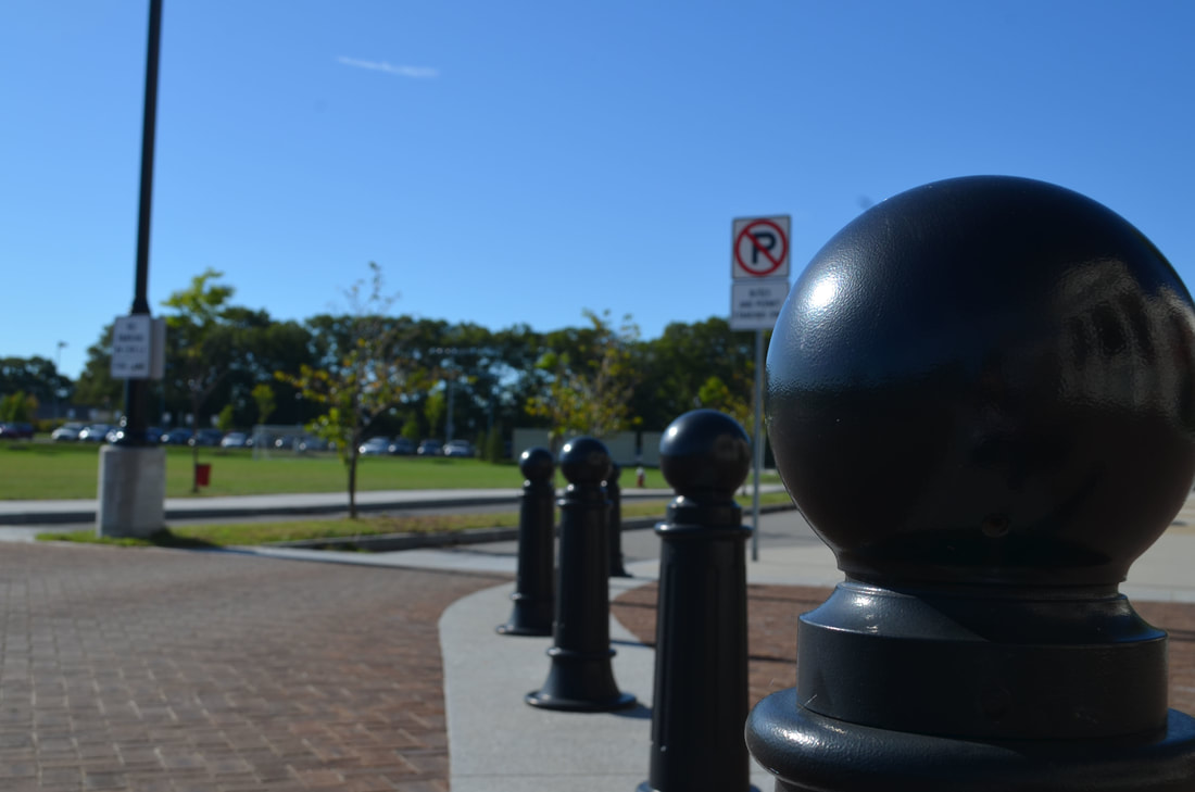

I took these photos around my neighborhood, as well as outside of the school. I took the photos from varying distances and angles, but I favored the close-up shots. My images are both horizontal and vertical. I considered the rule of thirds in most of the images, particularly the close-ups. The most dynamic photo I took was of the small poles in front of the school. It starts up close, as moves backwards.
Pattern and Texture


The image that I think could be overexposed is my sixth image, which is of a patterned bag. I think that there may be too much white space on it because of the white in the patten and the white on the wall, which makes the picture seem brighter. An image that I think could be underexposed is my fourth image, which is of a tunnel created by trees. Because it was a tunnel-like area, there wasn't proper lighting to take the picture, and it ended up being relatively dark. The image that I think is the most correctly exposed is my first image, which is of a bush with flowers on it. The image features both the bush and the sky, which are two different brightnesses, and contrast each other, displaying a range of brightnesses.
Dodge and Burn (Before -> After)
Power Lines & Playgrounds


I think my sixth picture of power lines best demonstrates the rule of thirds because the power lines are on the middle and top third of the photo.
My fifth picture of the slide best demonstrates point of view because I took it from the bottom of the slide, looking up towards the top.
I feel that my third picture of power lines best showcases positive and negative space, because the rectangular shapes between the power lines are negative space.
My seventh picture has a strong composition that leads the viewer's eye though the photo, because it has multiple swings moving at different speeds and heights.
My sixth picture best showcases power lines because there are many lines going in different directions and at different heights, creating a pattern with lines.
My fourth picture is the best example of black and white with proper exposure because the rock in focus is white, while the wall behind it is darker.
